
Nominet
As Senior Graphic Designer at Nominet I design across the whole business: event branding and conference stands, social campaigns, email sequences and print. Two pieces of that work are shown here: the first edition of Nominet’s annual publication, and the rollout of a new brand, launched to the whole company in a day.
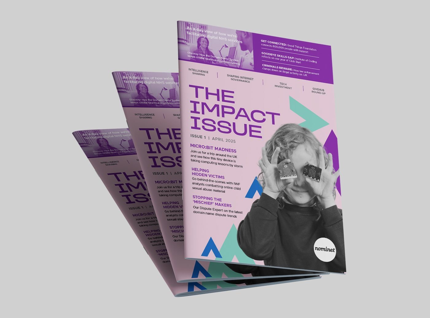
The Impact Issue
I led the design of the first edition of The Impact Issue, Nominet’s flagship annual publication about the difference it makes to society.
The stories run from digital entrepreneurship to internet safety, so the layout is pared back and built around the narrative, letting each one be read as a story. It went out in print and as a digital edition, and stakeholders praised how clearly it showed the part Nominet plays in the digital economy.
ClickTap a page to turn it — or use the arrows
Rebrand Rollout & Values Day Launch
- Challenge
- Turn an agency’s new identity into something a whole company could use — then launch it to that company.
- Idea
- Unveil the new look and the new values as one moment, with every value given its own image.
- Result
- A launch that landed, and a brand toolkit still in daily use.
The brief
An external agency created Nominet’s new identity. Our in-house creative team — four people, two of us designers — had to turn the handover into a brand the whole business could use, then launch it to colleagues. All of it alongside our usual workload.
Making it work
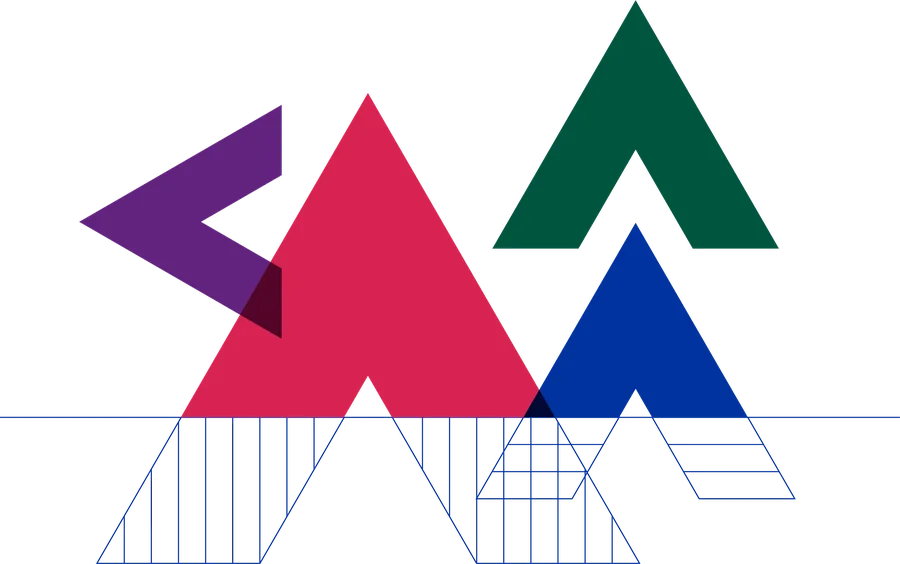
The guidelines needed a lot of refinement before they could work day to day. My manager and I rebuilt them, then built everything the brand needed to live: a bank of stock imagery and cut-out people and objects, a new icon set, reusable shape assets, a shared Adobe library, and templates for slides, documents, letterheads and every HubSpot email — including custom HTML builds and the weekly company update.
We worked with the digital team on the new website, and with comms on how the brand was shared — inside the company and out.


















The stakes
A rebrand only works if the people inside the company believe in it.
Values Day was the first time colleagues would see any of it. The project had been a closely kept secret for months, so the launch had one chance to land — and it had to introduce the new values at the same time as the new look.
The idea
Give every value its own image. I developed a range of visual metaphors for the values and presented them to HR; mine were the ones chosen. Then I designed everything for the day: pop-up banners, printed concertina hand-outs, stickers, digital signage and the main presentation deck.
Values Day


The outcome
The launch was very well received — a reset for how Nominet looks and how it talks about its values. The roller banners are still in use, and the slide template keeps evolving.
