Olympus Audio
A gaming-headset brand that doesn’t exist, built for the people who’d actually buy one: gamers. So it speaks their language. Every edition is a Greek god, launched the way a game is: a title logo, a box like a collector’s edition and a reveal film like a trailer. It began as a few logo mockups of mine and grew into a pantheon of sixteen.

Where it started
- Audience
- Gamers. The look comes from the title logos, boxes and trailers they already know.
- Starting point
- A handful of my own title mockups for a headset brand that didn’t exist.
- Goal
- Turn them into a brand system that holds up as a logo, on a box and in motion.
- Output
- Sixteen edition lockups with flat versions, three boxes and two reveal films.
The starting point
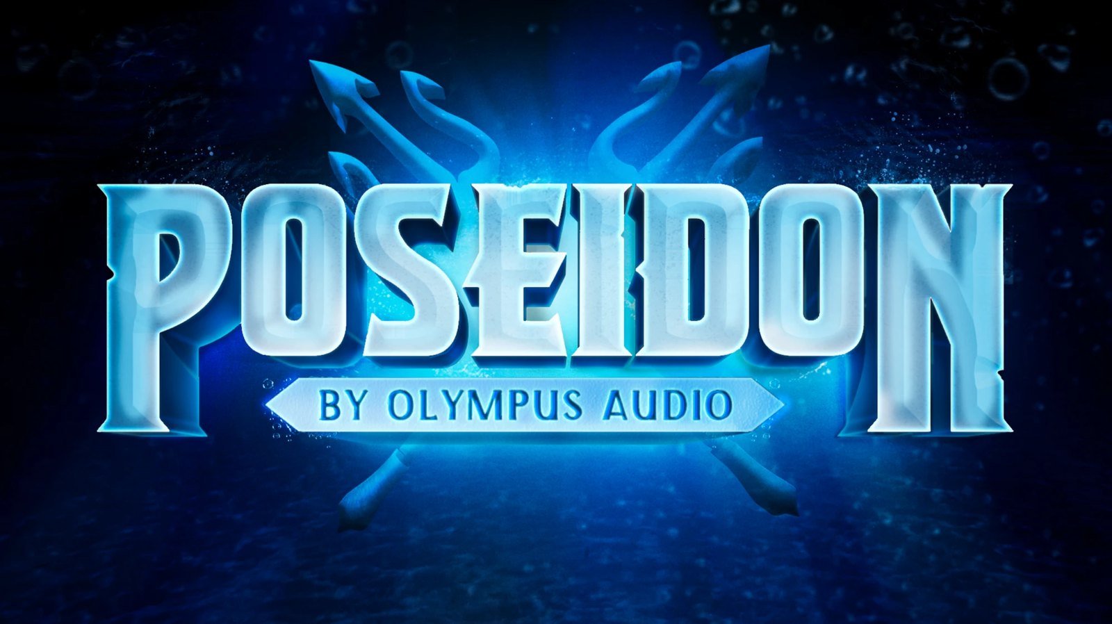
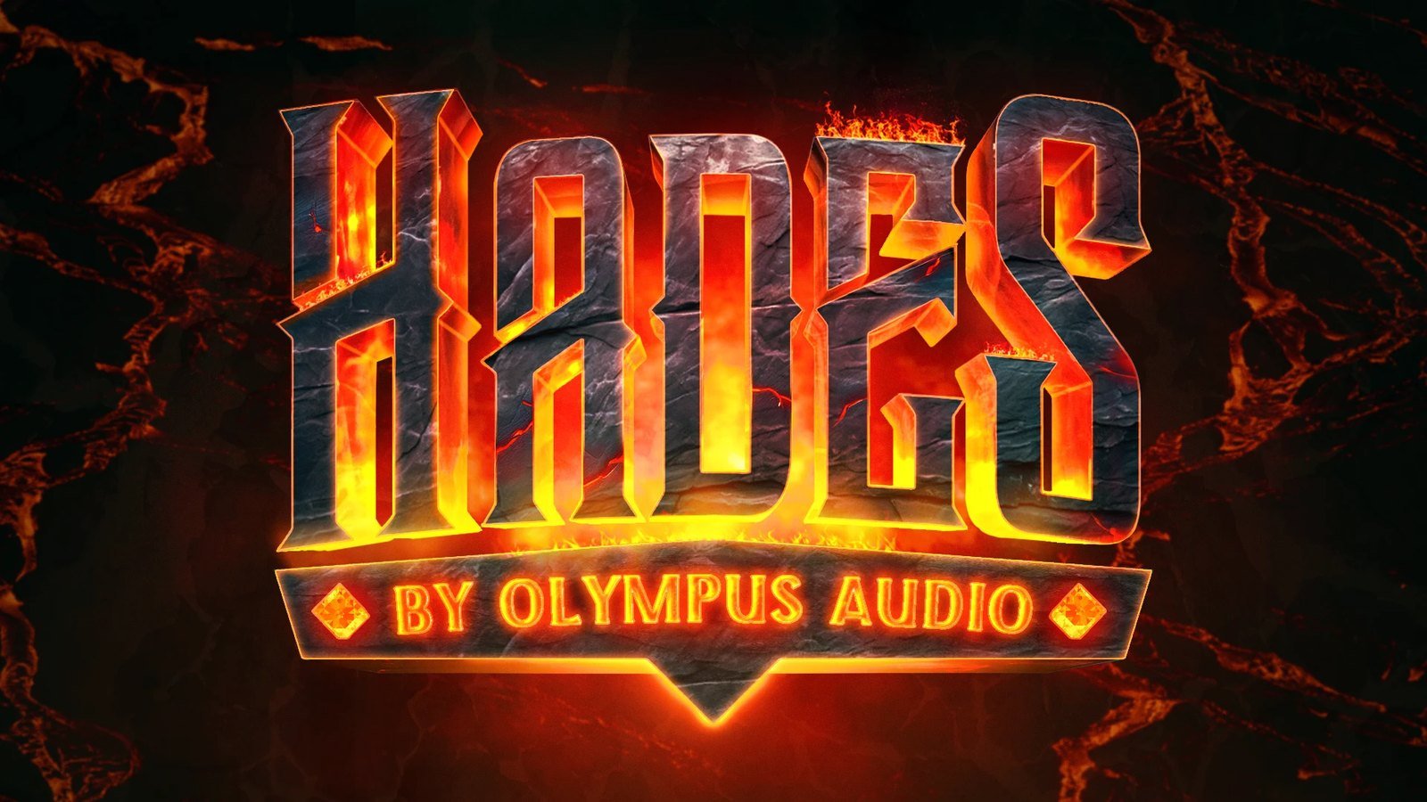
I’d made these a while back: game-title lockups for an imaginary headset brand, each edition named after a god. They had energy, but they were one-offs. Each one was built a different way, and nothing tied them together except the nameplate.
The question
What would a headset brand look like if it spoke the language of the games its buyers play?
Most hardware branding is sleek and quiet. Gamers spend their evenings around title screens, loot and launch trailers, so this one borrows from those instead. To be a real brand, it needed a system: rules that let any god join the line-up and still look like family, on a box, in a film or printed in one colour.
01 — The original mockups

A system of gods
The benchmark
Game update logos: the title cards studios release with each new game, season and expansion. Gamers see them every launch day, so the style reads as ‘this is for you’ straight away. They’re also built to read at thumbnail size over busy key art, which is exactly the job a box front has to do.
The rules
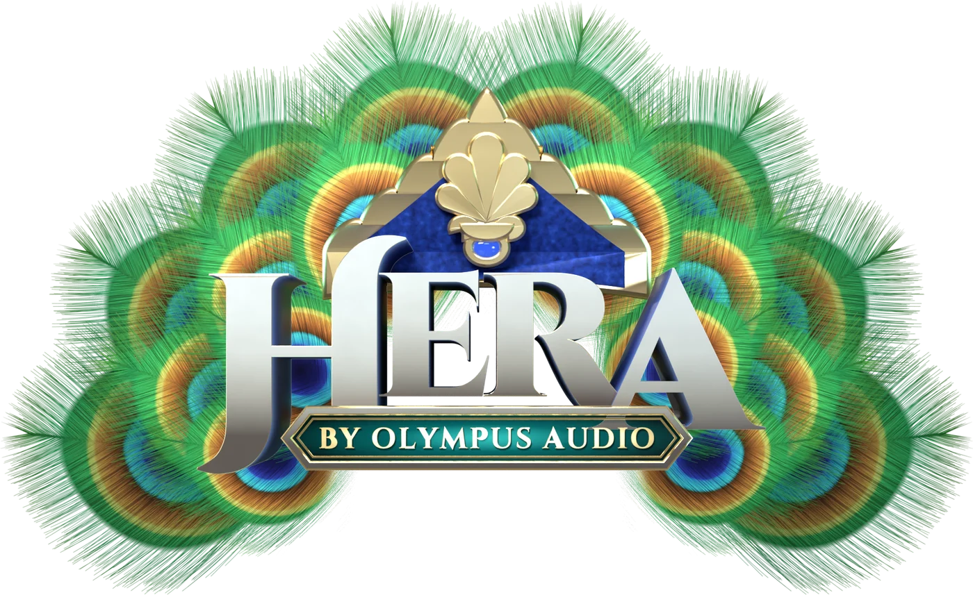
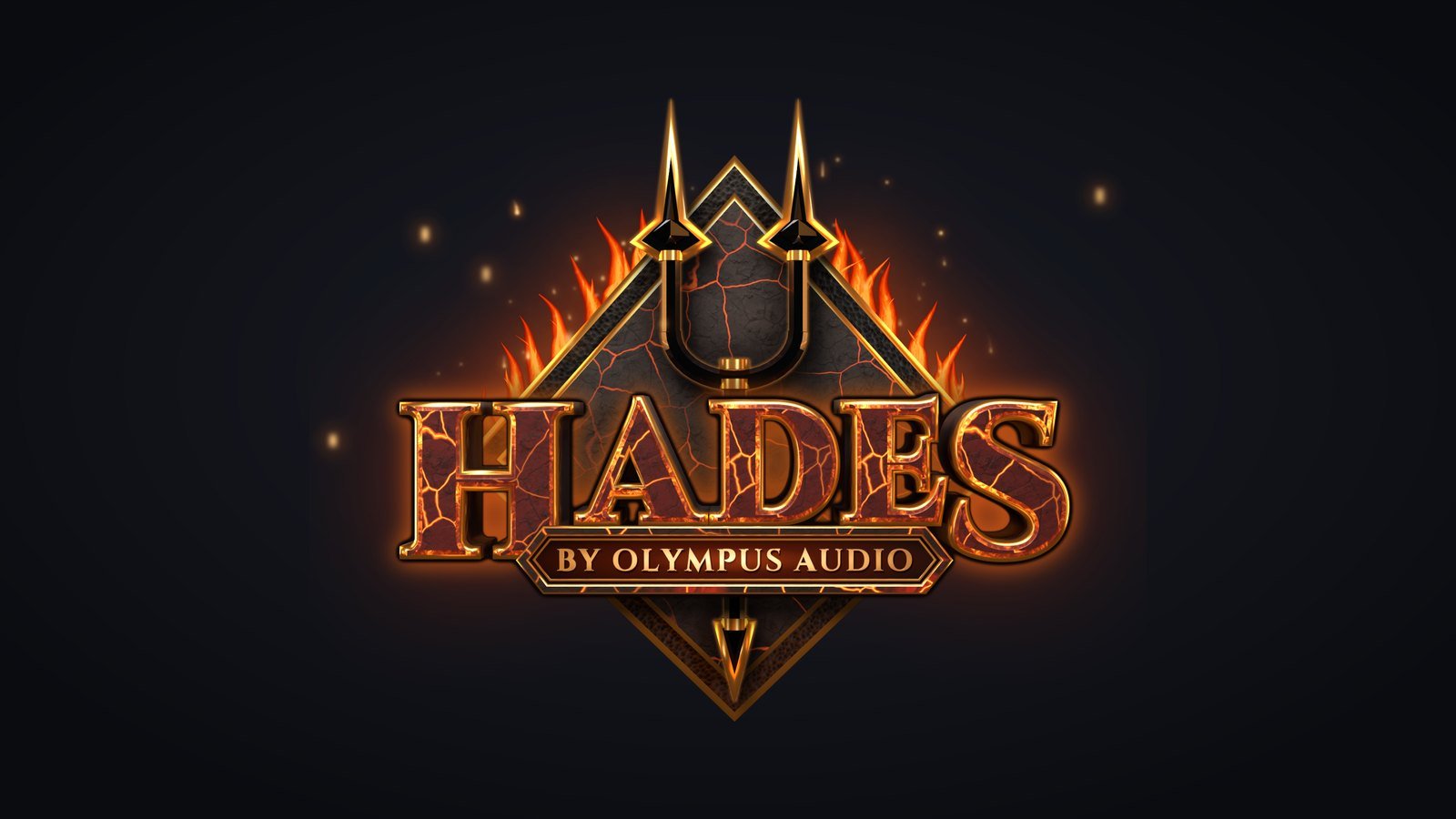
Every lockup has the same three parts: the god’s name, an emblem behind it and the ‘By Olympus Audio’ nameplate in front.
One saturated hue per name, pale at the top of each letter and deep at its base. A dead head-on camera, so every edition sits square on its box. And the emblem is built around the name, never the other way round.
The constant
The nameplate is the one part that never changes shape. Each edition can reinvent its type, colour and emblem, and the nameplate still says they all come from the same house.
Pick your god
Gods work the way factions and characters do in a game: each has a colour, an element and a personality, and players pick the one that feels like theirs. Poseidon is water, Hades is fire, Zeus is the storm. Choosing an edition is choosing a side.
02 — Anatomy of a lockup


03 — Then and now: the old mockups, rebuilt to the rules
Then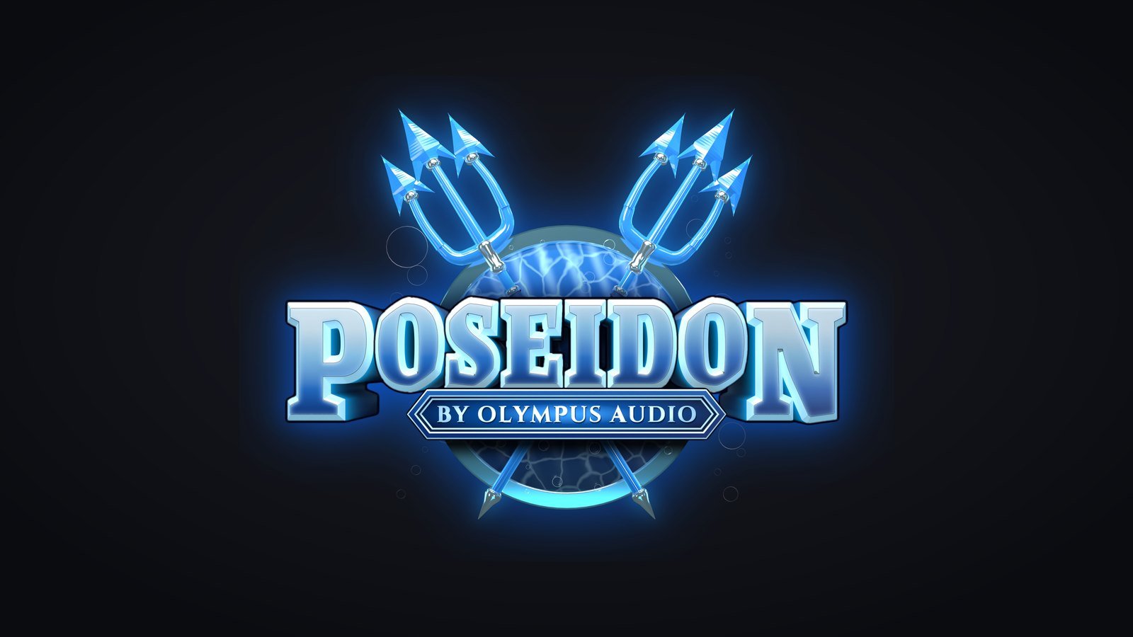 NowThen
 NowThen
 Now
Workings
Type first
Every god starts as a type audition: a dozen display faces set in the name and judged on how they read, before any 3D happens.
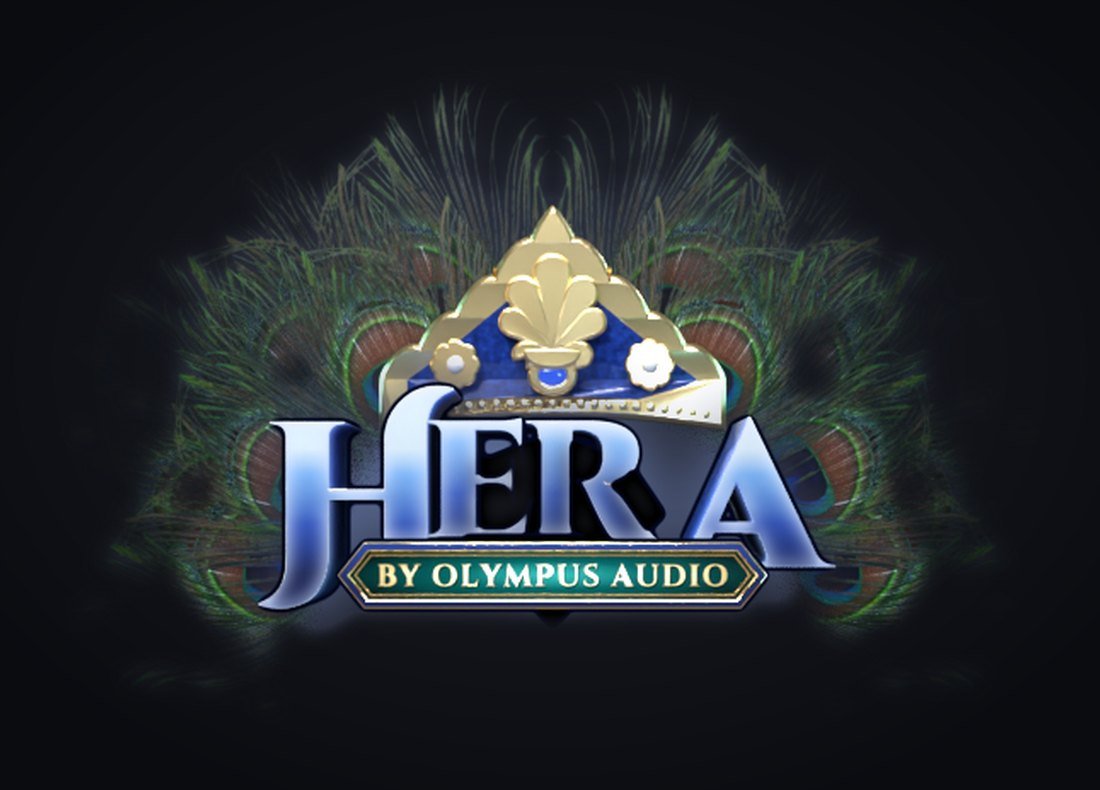
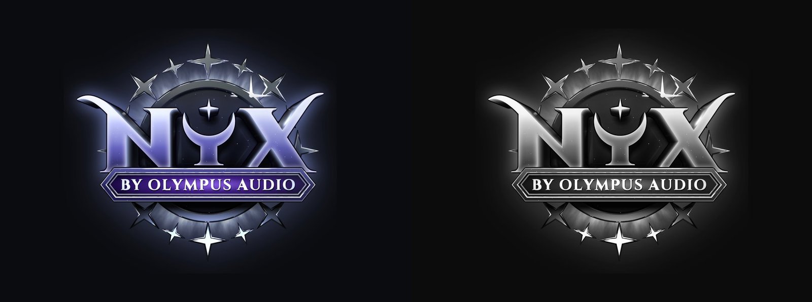
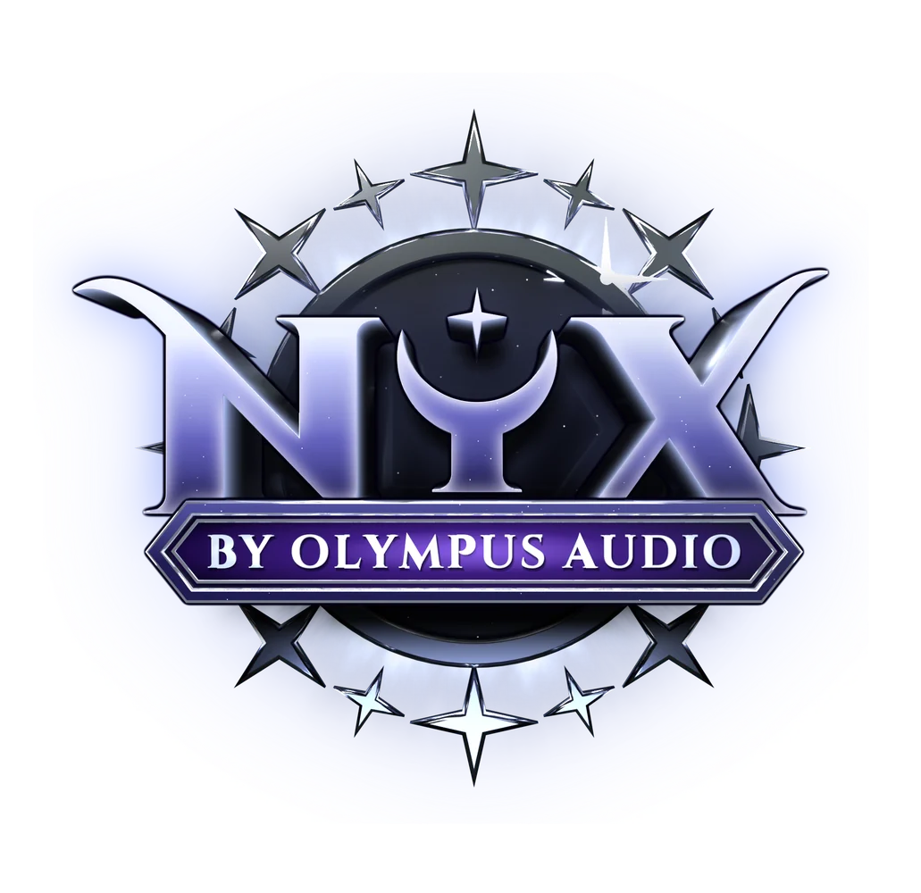
Some needed more than an off-the-shelf font. Hera mixes two weights of Cinzel, decorative capitals for the H and R and plain ones for the E and A. Eos’s chosen face wasn’t heavy enough, so I cut a bolder version of it. And Nyx’s Y became a crescent moon holding a star.
04 — Type auditions


Material tests
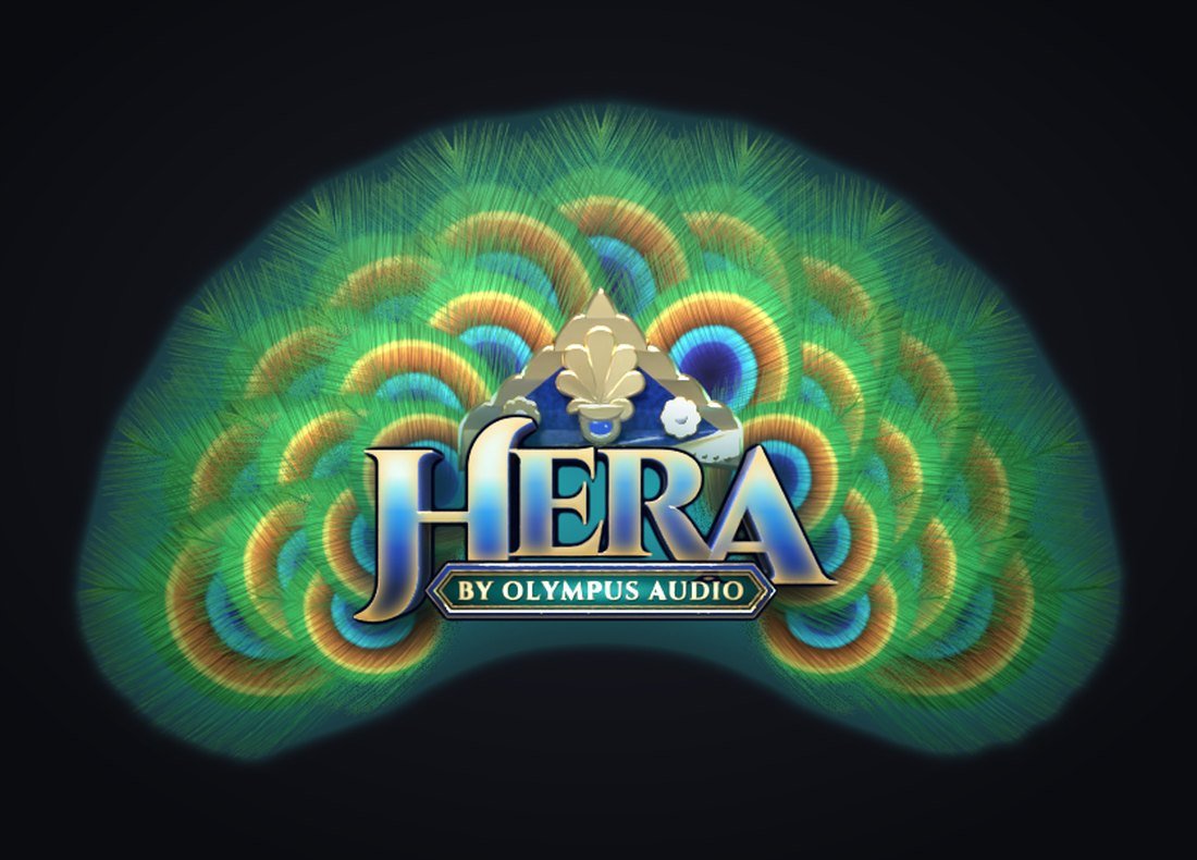
Hera took the most rounds. Peacock feathers cut out of photographs looked like low-resolution cutouts once they were lit in 3D. So I drew the feathers instead: each one is built from hundreds of individual barbs, coloured by the eye they pass through, so the feathers stay crisp at any size.
05 — Hera’s feathers: photo cutouts, then drawn barb by barb

Legibility
The rule I came back to most: the name has to be the brightest, clearest thing in the frame.
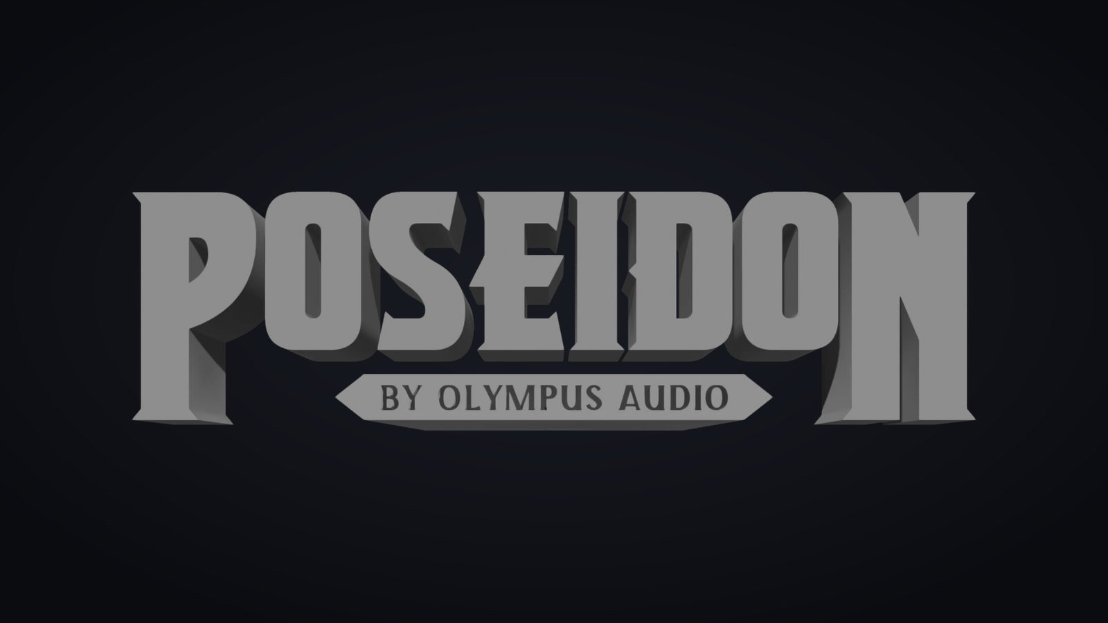
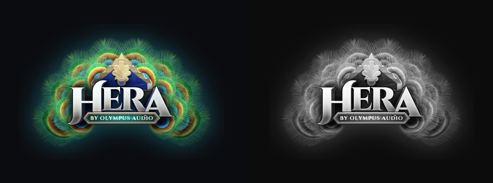
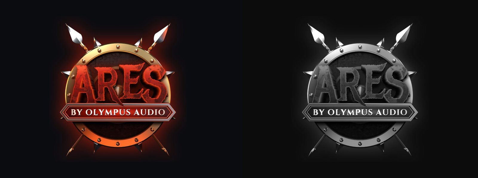
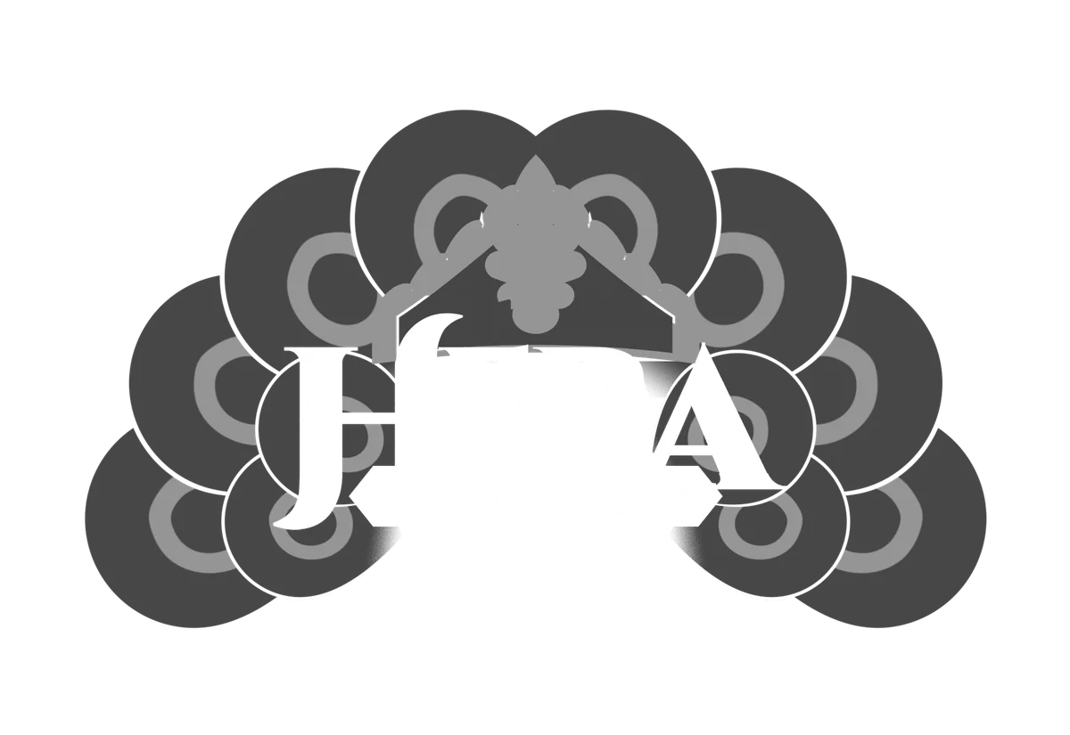
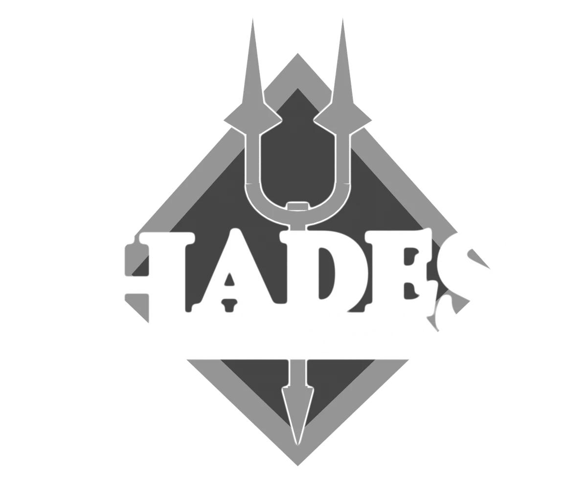
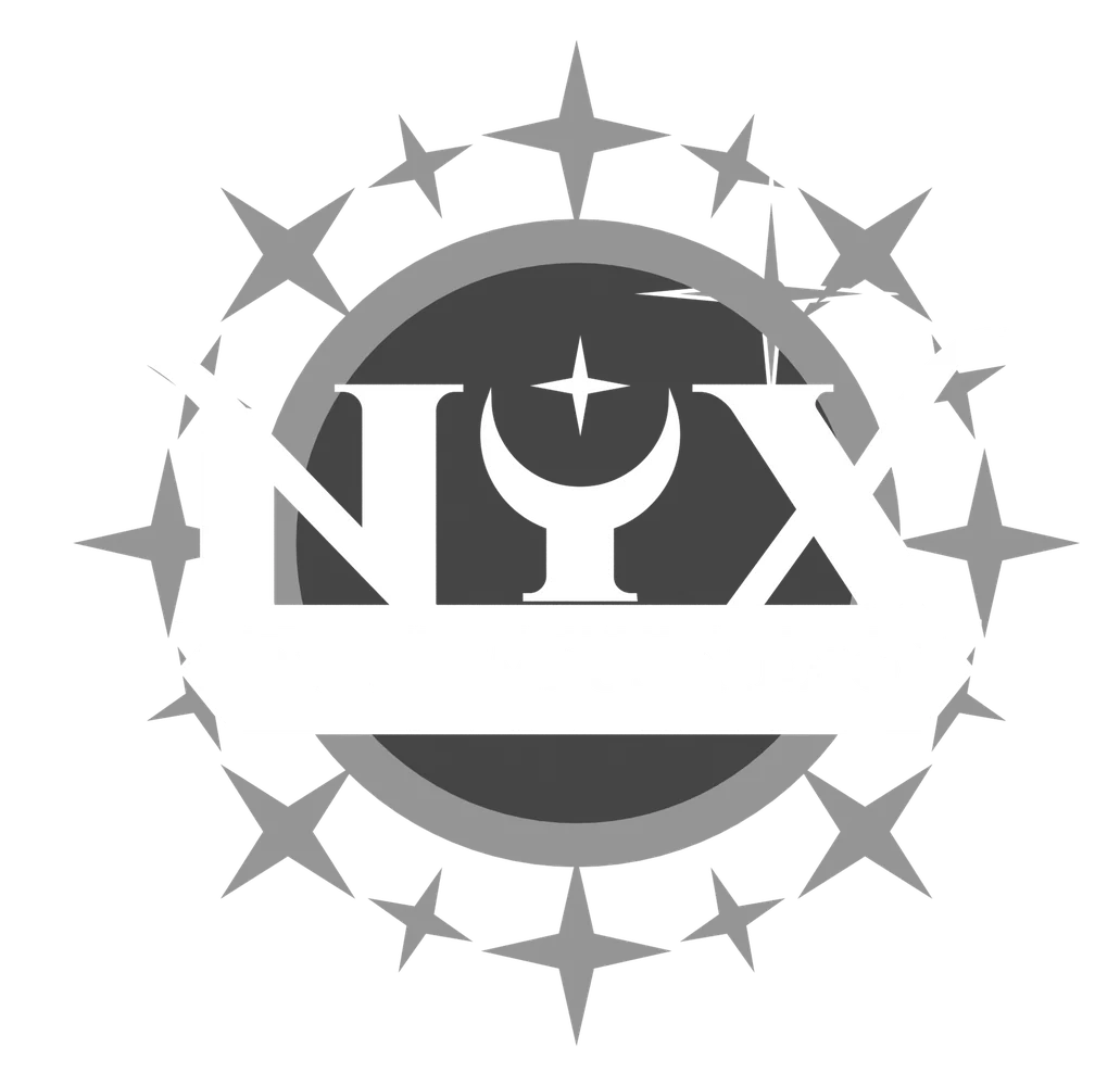
Every lockup was checked beside a greyscale twin. When the name got lost, the fix was contrast, never another effect. Stacking keylines, inner shadows and extra glows only ever made things worse.
06 — Greyscale twins

Finishing in 2D
The 3D render is where a lockup starts, not where it ends. Each one is finished in Photoshop as a layered file: a tight dark outline, cast shadows, glows in a colour that contrasts with the name, and a dodge-and-burn pass that lights the top of each letter and sinks what’s around it.
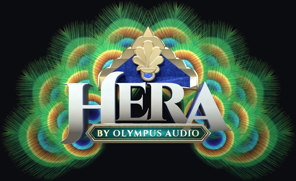
Separate render passes drive those layers, so every effect stays editable: a mask of the letter faces, and for Hera a depth pass that sets each feather’s shadow on the one behind it.
07 — One lockup, built up a layer at a time

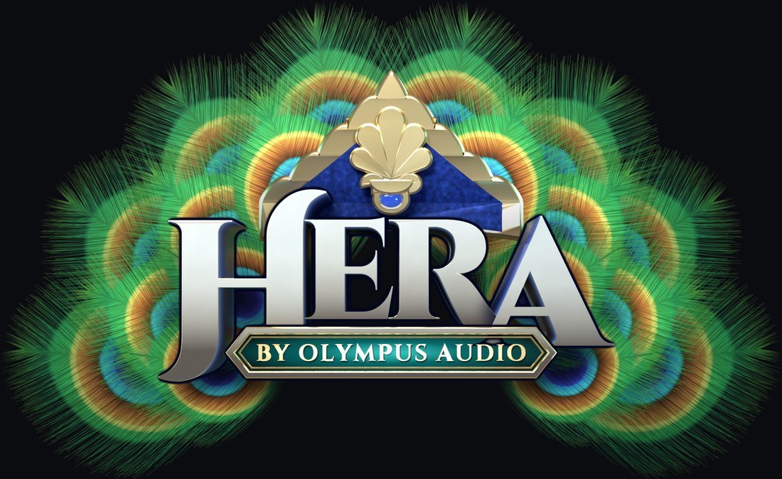
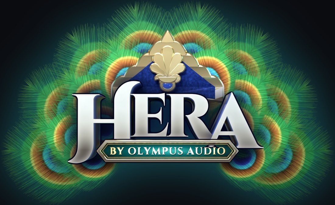

08 — The passes behind it: beauty render, letter faces, feather depth, flat


The pantheon
Sixteen gods
Once the rules were set, a new god came down to three choices: a typeface, a palette and an emblem, the way a game adds a new character to its roster. The sixteenth went together faster than the first.
A roster also needs range. Eos is a pink edition, made with women who game in mind.
Flat versions
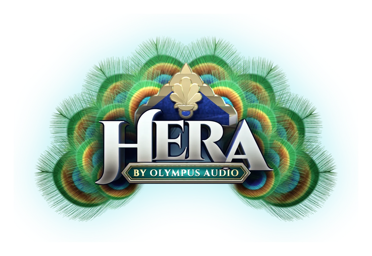
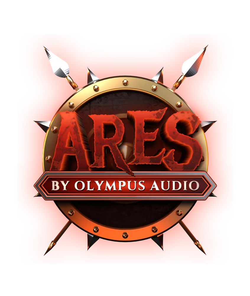
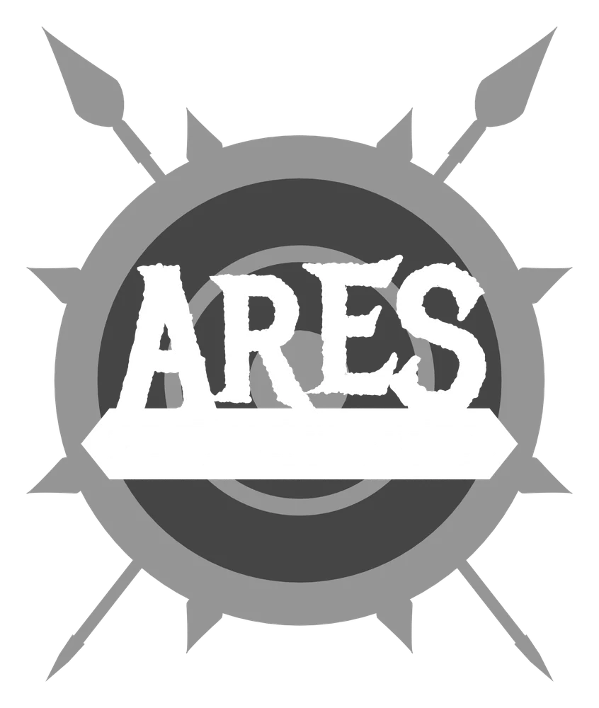
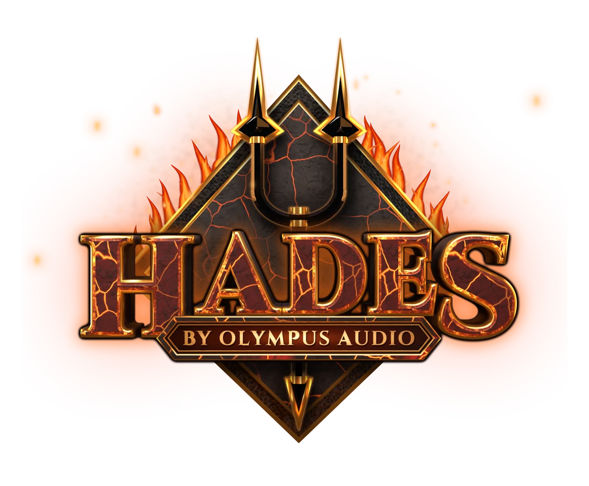
Every lockup also has a flat version for one-colour use: solid white type, the emblem in two greys, and thin cut lines where parts overlap instead of outlines. It’s a good test of whether the shape is doing the work or the lighting is.
09 — Finished and flat, side by side
From logo to box
Loud box, quiet product
The packaging can shout; the headset shouldn’t.
On the box, each edition gets its full lockup, its element and its colour. On the ear cup, the god becomes a single monoline mark, etched into brushed metal and lit from behind by the edition’s colour.
The box
Treated like a collector’s edition rather than an electronics box. 22 × 26 × 12 cm with a flush lid, so the front art carries across the seam. The fronts are loud and the backs go quiet: the headset, the spec and one line.
10 — Box fronts and backs

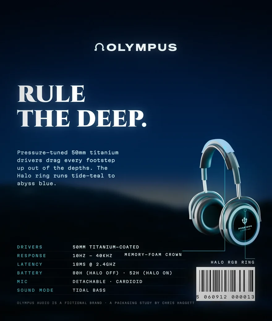

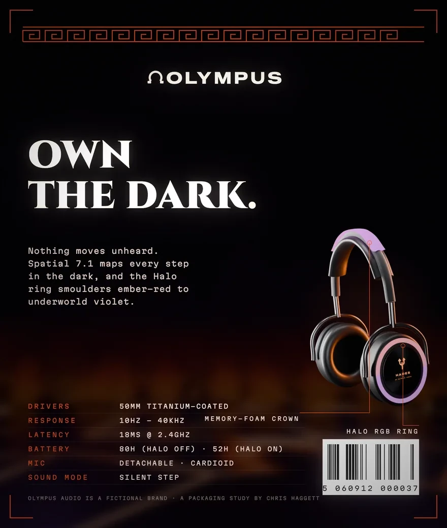
11 — The Poseidon box, flat

12 — The master brand and the cup marks




The range
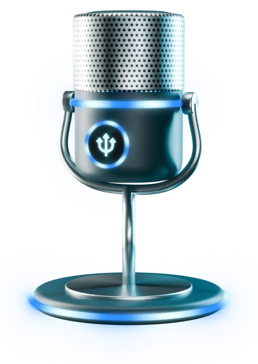
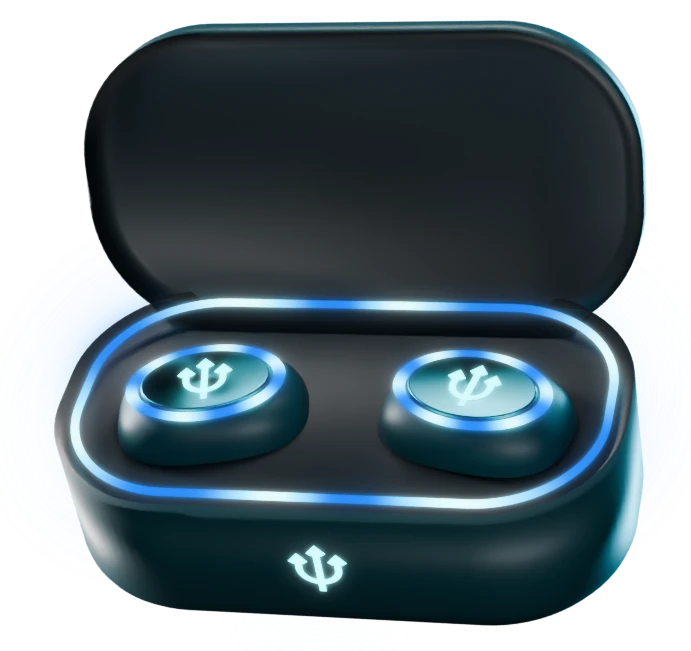
Later the brand grew past the headset: a version with a boom mic, a desk mic and wireless earbuds, each made in every edition.
Light as identity
Every god has its own LED pattern, so a set reads as one edition even side by side. Poseidon’s light moves in waves, Hades flickers like fire and Zeus runs in segments that flash. The smaller pieces drop the full logo and carry just the god’s icon, lit from behind.
13 — The LED patterns: tide, ember and storm



14 — The range, one edition at a time





The reveal
Built, not painted
Each edition gets a reveal film, the way a new game or season gets a trailer: the headset rises out of its god’s element.
The elements are simulated or scanned rather than painted: an ocean simulation for Poseidon; for Hades, a lava sea that cracks, bubbles and spits. The rock is photogrammetry and the skies are real storm photography. Both films share one animation and one beat, so the editions play as a series.
What I took from it
Design for the audience’s world, not the category’s. Borrowing from games rather than from other headsets is what gives the brand its pull.
Systems beat one-offs. The old mockups were each a fresh start; with the rules in place, every new god built on the ones before it.
And restraint. The strongest versions came from fixing contrast and light, not from adding effects.
Olympus Audio is a fictional brand. Typefaces: Cinzel, Cinzel Decorative, Gloock, Cormorant SC, Fondamento, IM Fell English and others, all under the SIL Open Font License. 3D scans: Poly Haven (CC0). Film skies: NOAA Photo Library / NSSL (public domain). Film fire: Mixkit stock footage (Mixkit Free License). Eos clouds built from “Cloud” by Poly by Google (poly.pizza, CC BY 3.0). Hades flames textured with “Flames in the night” by Patrick Hendry (Wikimedia Commons, CC BY-SA 4.0). Box-art flames: Henry Wadey (CC BY 3.0); lightning and embers: NOAA Photo Library (public domain) and Unsplash.